General Principles
Setting default styles on the Theme pane, though optional, saves a lot of time and effort. An element that appears multiple times throughout a tool can have its background color, border size and color, text size and color, alignment and other properties set once instead of each time the element occurs. If you need to, you can always override the properties you set in Theme when styling elements on the individual pages of the tool.
You have almost unlimited choices in background, border and text colors, as well as in font sizes and styles, but remember, simple is usually best! We suggest that you set a font size of at least 12 points for all text and that you coordinate colors and fonts to your website. Your webmaster can probably even give you the official "web numbers" for a few coordinating colors (see Color Picker).
Viewing, Selecting and Altering Styles
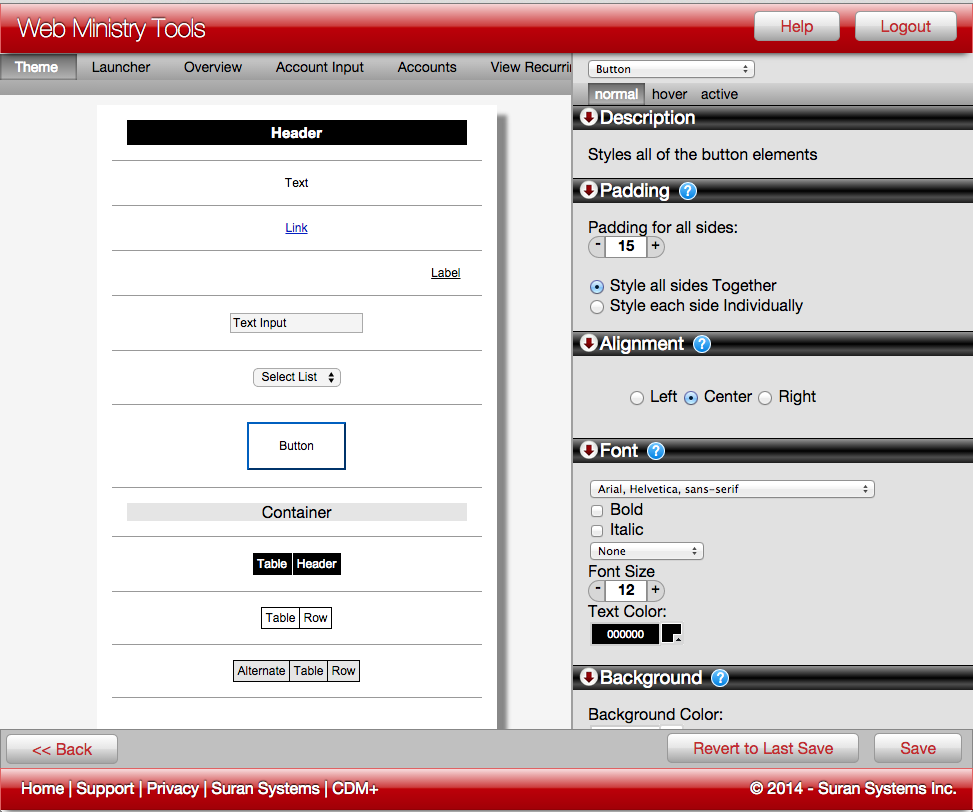
Click the Theme pane above the tool preview in the Designer. Select the type of element you want to style by 1) clicking on it in the preview or 2) choosing it in the dropdown menu at the top right of the window. Navigating the elements to style in the Theme pane is very similar to navigating the Designer's individual elements.
The type and number of elements available to style vary by tool. In our example we have selected Button. The properties you choose from the many options at the right will apply to all buttons on the tool unless you decide to uncheck Use Theme Value for a specific button.
Examples of Theme Elements to Style
-
Header
-
Text
-
Link
-
Label
-
Text Input
-
Select List (Dropdown List)
-
Button
-
Container
-
Table Header
-
Table Row
-
Alternate Table Row
Styles are available when multiple elements on a tool have similarities. So if there is more than one button, you will see a Button Style, for example.
Overriding Styles
Any Element affected by a Theme will have a Use Theme Value Checkbox beside the appropriate properties in the Properties Pane. These checkboxes are checked On by default. Unchecking some but not others makes it possible to selectively override the default styles set for an element in the Theme.
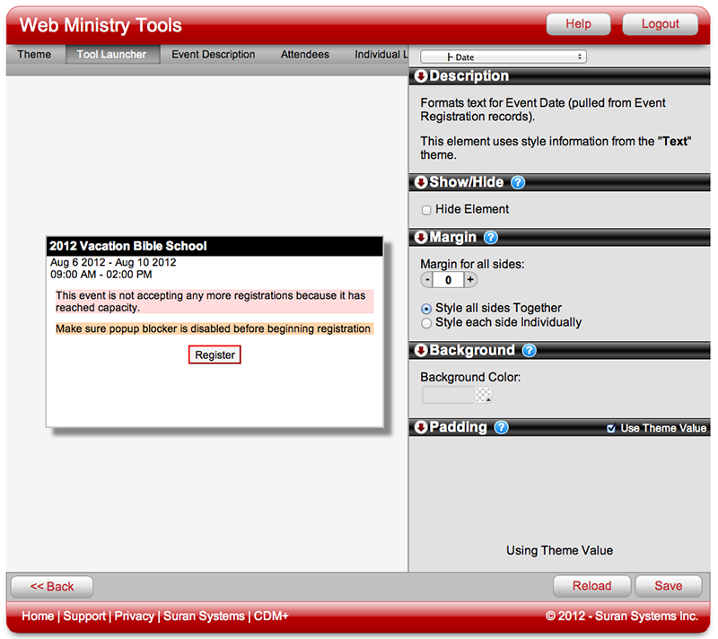
Let's use Text as an example. First, let's say that in the Theme for the Single Event Registration Tool "2012 Vacation Bible School" you set the Font properties for Text to be 14 point black text. Back on the tool preview for the Launcher, you can see that all applicable text elements on the Launcher indeed have 14 point black text. The elements on the Launcher that pick up the style "Text" are date, time, the over-capacity message and the disable popup blocker message.
Let's say that you want the text for the date to be larger and red. Select the Date element, and under Font uncheck the Use Theme Value checkbox. Change the font size to something larger (we picked 18 point) and the text color to any red you desire, using the Color Picker.
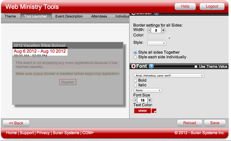
By unchecking Use Theme Value, you can change one text element, in this case Date, without affecting the other text elements that you want to remain 14 point black. (We can also make adjustments so that the date is not so near the header. Learn how to do that using Padding.)