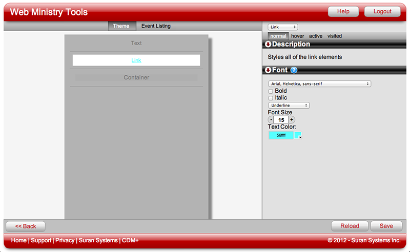
A link is an element on a website that takes you somewhere else—either to a different area of the site or to another site entirely—or causes something to happen. Styling the text on a link is exactly like styling Font properties. The difference is that you can set the styling of the text on a link to change to show users where they are, where they need to click to go somewhere else (or do something else) and which parts of your site they have already viewed or visited.
Examples of Links
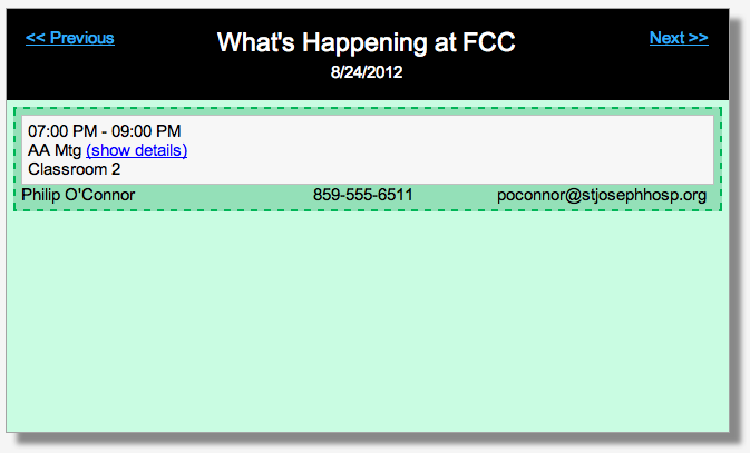
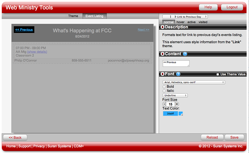
A typical Event Listing Tool has examples of links that do different things. The Previous Linkand Next Link elements in the tool's header are used to navigate the tool's view by dates. The Toggler element shows/hides event details. These are just two examples of links and their abilities.
The Four Link Font Properties
Each link will have four font properties to style: Normal, Hover, Active, Visited. Each of the four will have the same set of options. The descriptions below tell how each font property applies to the link.
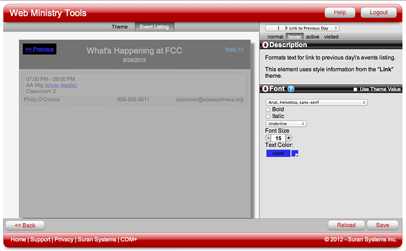
Normal
Normal styling applies to a link that has not yet been visited or clicked on by the user.
Hover
Hover styling applies to link text when the user "hovers" over the link with a cursor or mouse.
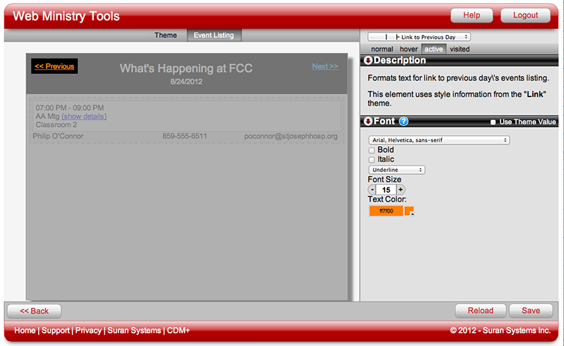
Active
Active styling applies to link text when the user is clicking on it. Often this styling only appears for a second, but a change in color, size or boldness often lets the user know that they have successfully activated the link.
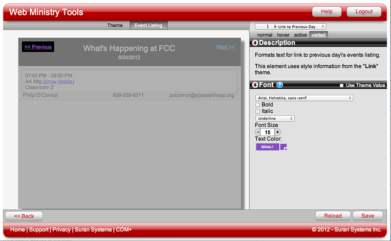
Visited
Visited styling applies to links that the user previously visited or clicked on.
Using Styles
Any tool that has more than one link will have a Style called Links. Since you likely will want to style all links on a tool the same way, it is a big time saver to use the Styles for Links.